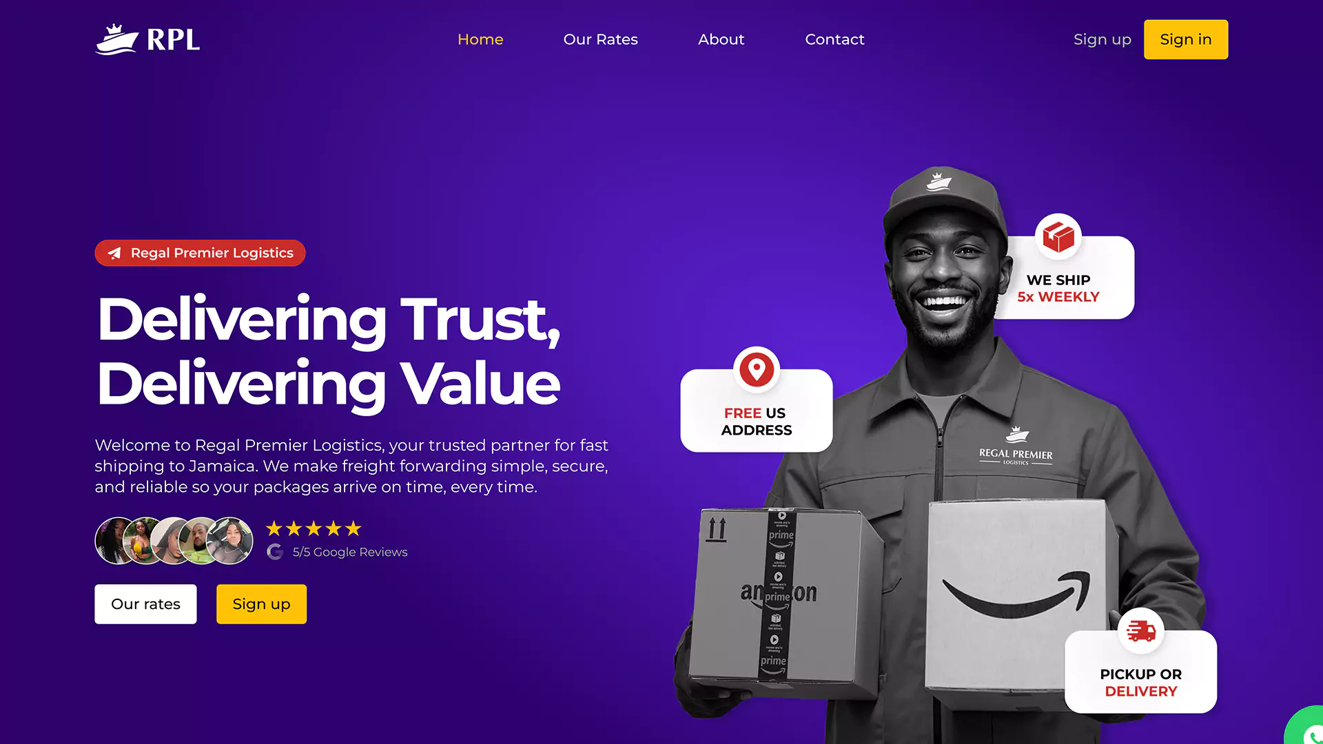
Muplix partnered with Regal Premier Logistics to create a professional logo and brand identity that reflected their reputation in shipping and logistics. The goal was to design a visual system that would inspire trust and stand out in a competitive market.
Primary Color
#f2a71b
Secondary Color
#5f22d9
Accent A
#ffc107
Accent B
#c92b28
Design Concept
The Regal Premier Logistics logo combines a crown to symbolize authority and premium service with a ship that represents global shipping and logistics. Purple was chosen as the primary color to highlight royalty, prestige, and professionalism. The overall identity positions Regal Premier Logistics as a distinguished and trustworthy provider.
Target Audience
The brand identity was designed to connect with:
Jamaican customers who rely on fast and reliable shipping.
Businesses seeking logistics partners with credibility and professionalism.
Individuals looking for simple, secure, and stress-free shipping solutions.
Logo Variations
Typography
Challenges
The client needed a logo that could balance tradition and modernity while appealing to both businesses and individual customers. Another challenge was ensuring the brand identity felt premium without being overly complicated.
Solutions
Muplix simplified the design into clear, recognizable symbols with strong visual impact. By integrating the crown and ship into one cohesive mark, the logo delivers both prestige and industry relevance. The brand guidelines created by Muplix ensure consistency across social media, print, and digital platforms.
Design Deliverables
Vector files (optimized for print) and media assets were delivered to the client upon project completion.
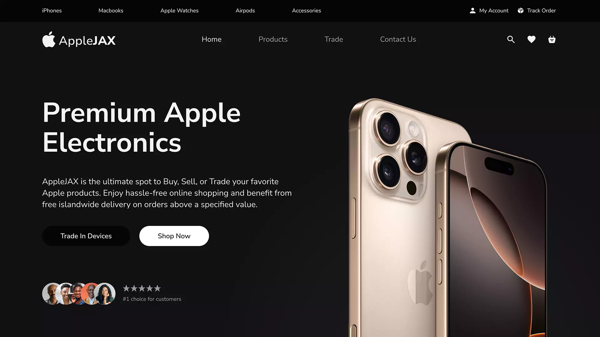
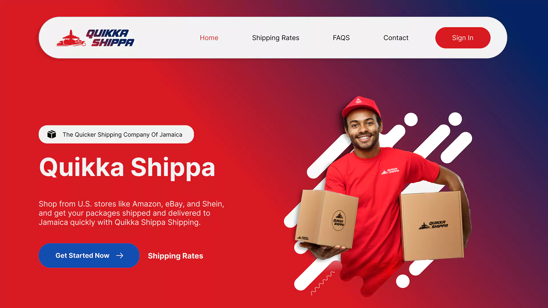
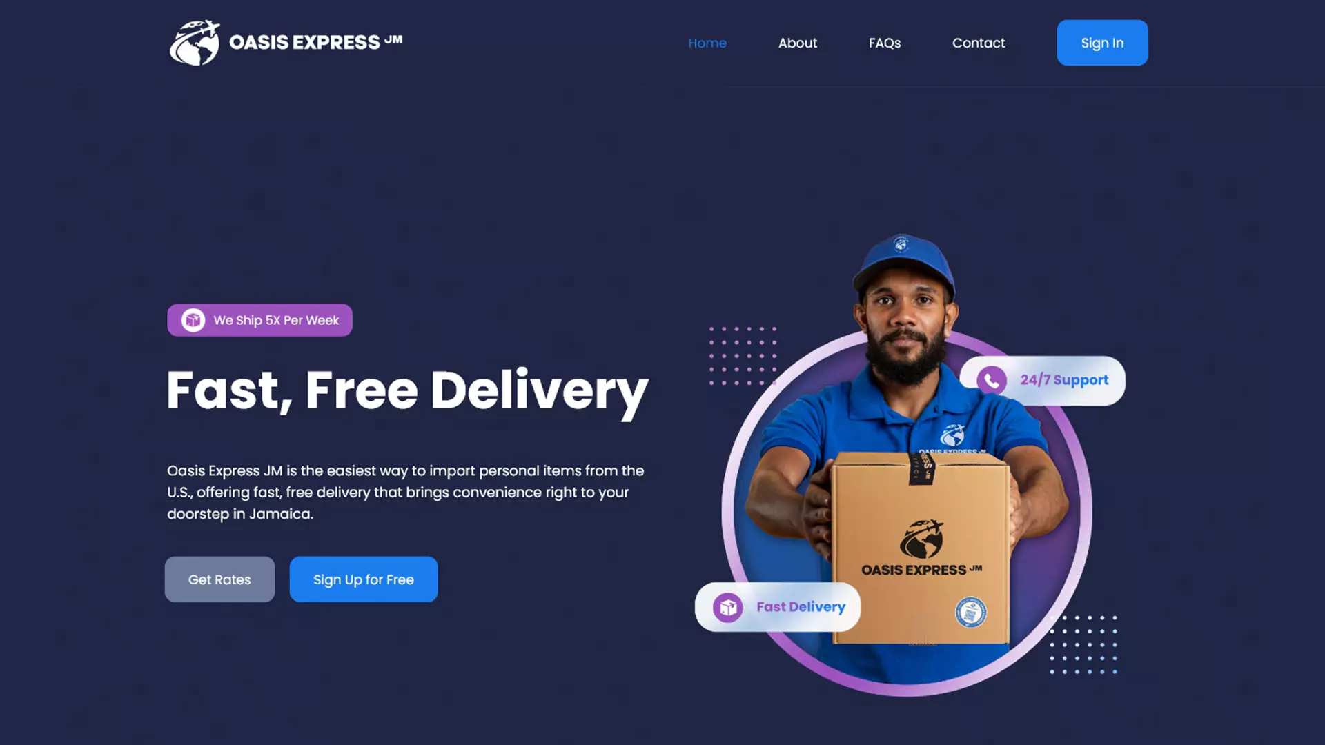
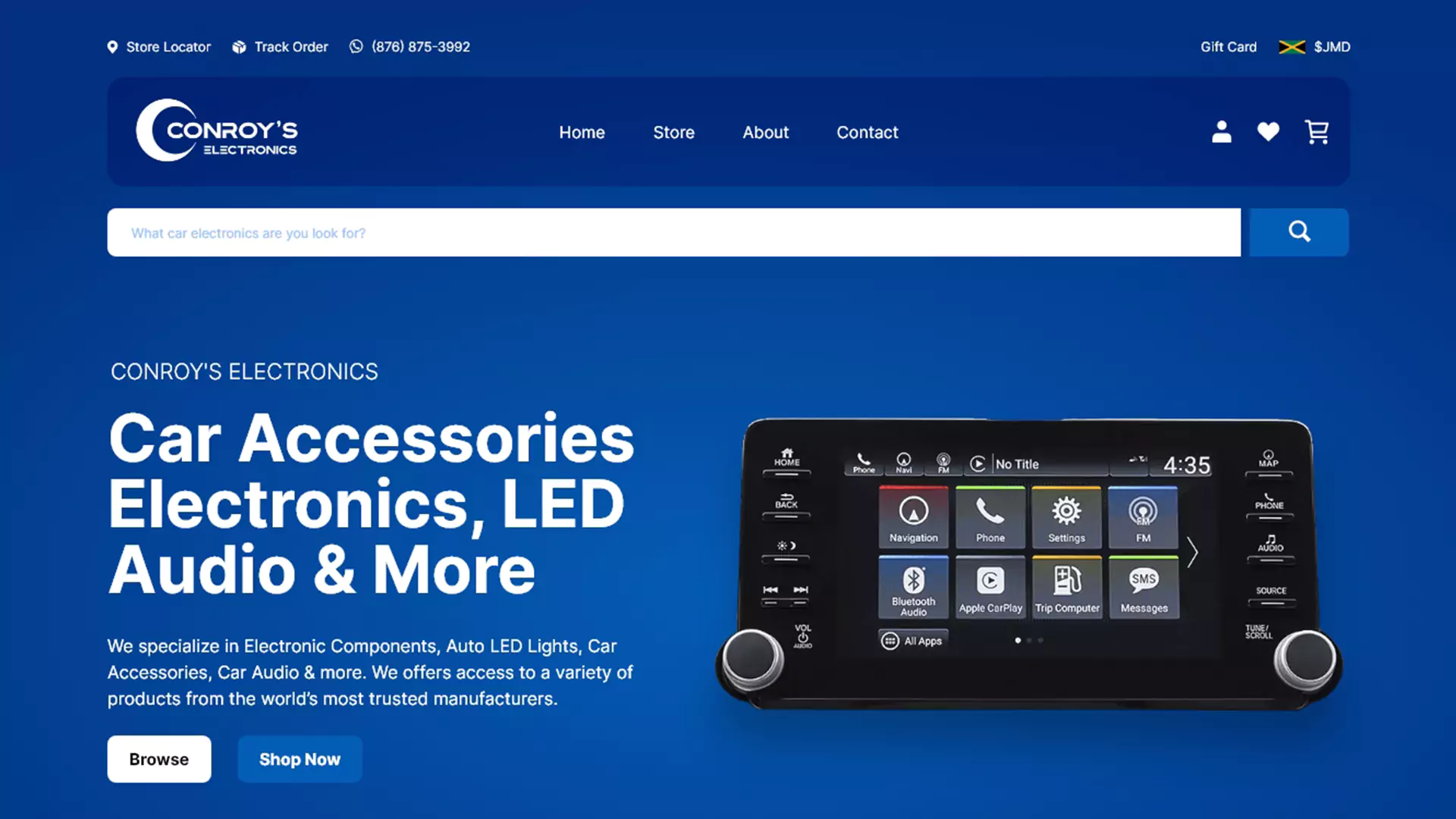
Web Design
Muplix also designed the website, maintaining a consistent design by using the same color palette to align with the brand identity.