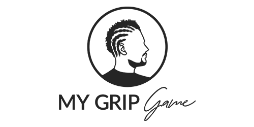
My Grip Game approached Muplix for a complete brand identity overhaul, with a focus on short hair braiding and hair care products. The goal was to craft a modern and professional brand that resonates with individuals who have short hair, as well as men experiencing hair loss. Muplix delivered a cohesive branding package, which included a custom-designed logo with multiple variations, product labels, realistic mockups, and business cards, all tailored to reflect the company’s unique vision and appeal.
The concept behind My Grip Game’s brand identity, crafted by Muplix, focuses on creating a bold, professional, and approachable image that appeals to both short-haired individuals seeking braids and those in need of hair loss solutions.
Color Palette:
Typography:
Logo Variations:
Muplix provided multiple logo variations, including horizontal, vertical, and monochrome versions, ensuring flexibility for various applications while maintaining a consistent and cohesive brand image.
My Grip Game’s target audience includes two key groups:
The brand is dedicated to offering tailored products and services that meet the unique needs of both audiences, blending style and hair care expertise.


The client wanted a minimalistic design in a monochromatic scheme that was still impactful. Balancing simplicity with a strong visual message, while ensuring the design reflected the brand’s expertise in short hair braiding and hair care, was a key challenge.
To achieve this, we focused on using clean lines and a single, bold silhouette that directly communicates the brand’s core service—braiding. The monochrome palette, utilizing shades of black, white, and grey, was carefully chosen to create contrast and clarity, ensuring the logo stands out without overwhelming the viewer. The use of two contrasting fonts—Lato for professionalism and a script font for personal touch—helped maintain the minimal yet distinctive look. The end result is a sleek, modern design that conveys both professionalism and creativity, aligning perfectly with the client’s vision for simplicity and impact.
Vector files (optimized for print) and media assets were delivered to the client upon project completion.


Muplix also designed the website, maintaining a consistent design by using the same color palette to align with the brand identity.